
Experimenting with Exploratory Data Analysis
In this article, we will explore the process of exploratory data analysis (EDA) in the context of machine learning projects.
The exploratory data analysis (EDA) is a crucial step in any machine learning project. In this article, we will conduct some experiments with EDA to better understand how we can use it to gain valuable insights from our data and improve the performance of our models.
Previous article: The Workflow in Machine Learning Projects
A Practical Exercise: Estimating Café Sales
To understand the true impact of Exploratory Data Analysis (EDA), let's move beyond theory and dive into practice with a commercial scenario: Estimate the monthly revenue a café will generate. This type of exercise allows managers and business owners to make data-driven decisions rather than relying on gut feelings.
You can follow this interactive exercise in Google Colab: EDA for Estimating Café Sales
Step 1: Data Generation and Loading
As the first step, we need a historical dataset. We will simulate the data for 365 operational days of the café, with variables ranging from ambient temperature to advertising investment (Ads on social media). We import the essential tools from the classic Python stack: pandas for handling tables, and matplotlib/seaborn for visualizations.
import pandas as pd
import numpy as np
import random
import matplotlib.pyplot as plt
import seaborn as sns

np.random.seed(42)
random.seed(42)

n = 365
weathers = ["Sunny", "Rainy", "Cloudy"]
data = []

for _ in range(n):
    temperature = round(random.uniform(15.0, 35.0), 1)
    ad_investment = round(random.uniform(10.0, 150.0), 2)
    nearby_events = random.choice([0, 1])
    applied_discount = random.choice([0, 10, 15, 20])
    weather = random.choice(weathers)

    sales = (
        500 +
        (ad_investment * 2.5) -
        (temperature * 8) +
        (nearby_events * 250) +
        (applied_discount * 5)
    )

    if weather == "Rainy": sales += 150
    elif weather == "Sunny": sales -= 50

    sales += np.random.normal(0, 80)

    data.append([temperature, ad_investment, nearby_events, applied_discount, weather, round(sales, 2)])

columns = ["temperature_c", "ad_investment", "local_event", "discount", "weather", "daily_sales"]
df = pd.DataFrame(data, columns=columns)
df.head()
Step 2: Knowing the Data (Initial Exploration)
With df.info() we check for missing values (nulls) and data types, while df.describe() provides a summary of the average, maximum and minimum daily sales and expenses.
# A quick look at the health of our table
print(df.info())

# Descriptive statistics (averages, quartiles, min/max)
print(df.describe())
Resulting in the following:
<class 'pandas.core.frame.DataFrame'>
RangeIndex: 365 entries, 0 to 364
Data columns (total 6 columns):
 #   Column         Non-Null Count  Dtype
---  ------         --------------  -----
 0   temperature_c  365 non-null    float64
 1   ad_investment  365 non-null    float64
 2   local_event    365 non-null    int64
 3   discount       365 non-null    int64
 4   weather        365 non-null    object
 5   daily_sales    365 non-null    float64
dtypes: float64(3), int64(2), object(1)
memory usage: 17.2+ KB
None
       temperature_c  ad_investment  local_event    discount  daily_sales
count     365.000000     365.000000   365.000000  365.000000   365.000000
mean       24.648767      82.490247     0.561644   11.684932   735.927151
std         5.687482      40.828333     0.496867    7.270059   204.863687
min        15.100000      10.060000     0.000000    0.000000   226.620000
25%        19.800000      48.400000     0.000000   10.000000   576.890000
50%        24.500000      84.780000     1.000000   15.000000   729.730000
75%        29.600000     120.280000     1.000000   20.000000   879.280000
max        35.000000     149.780000     1.000000   20.000000  1337.220000
Let's explore the results:
- The average temperature is 24.65°C, with a range between 15.1°C and 35°C.
- Advertising investment varies widely, averaging
$82.49and reaching a maximum of$149.78. - 56.16% of the days had a local event.
- The discount applied varies, averaging 11.68% and reaching a maximum of 20%.
- Daily sales average
$735.93, with wide variability, ranging from a minimum of$226.62to a maximum of$1337.22.
Furthermore, there are no null values in the dataset, which is a good sign for further analysis. The wide variability in daily sales suggests that there are significant factors affecting sales, making exploratory data analysis even more crucial for understanding these relationships.
Step 3: Strategic Visualization
The best way to understand our data is through visualization. We will build three key charts for our analysis:
- Sales Histogram: Tells us if our daily profits follow a normal curve (Gaussian Bell) or if they are skewed.
- Scatter Plot (Dispersión) Advertising vs. Sales: Reveals whether investing more money in Ads actually increases sales or if it reaches a plateau (decreasing returns).
- Correlation Matrix: Is the "holy grail" of EDA. It will assign a value from -1 to 1 to the relationship between all our variables.
# 1. Sales distribution (Do we sell more on "good" or "bad" days, statistically speaking?)
plt.figure(figsize=(8,5))
sns.histplot(df["daily_sales"], bins=20, kde=True, color="brown")
plt.title("Distribution of Daily Coffee Sales")
plt.xlabel("Sales in $")
plt.ylabel("Frequency (Days)")
plt.show()

# 2. The Impact of Ads
plt.figure(figsize=(8,5))
sns.scatterplot(x="ad_investment", y="daily_sales", hue="weather", data=df)
plt.title("Ad Investment vs. Sales")
plt.xlabel("Investment ($)")
plt.ylabel("Sales ($)")
plt.show()

# 3. The heat map
plt.figure(figsize=(8,6))
sns.heatmap(df.corr(numeric_only=True), annot=True, cmap="YlOrBr", fmt=".2f")
plt.title("Variable Correlation")
plt.show()
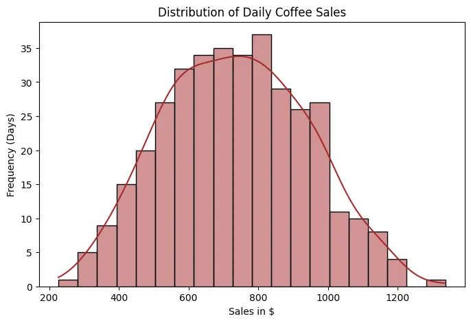 Sales Histogram
Let's start with the histogram, which allows us to visualize how daily sales are distributed over time. In this case, we observe that sales follow an approximately normal distribution, with a mean close to $800. This means that most days sales are concentrated around this average value, and that days with very low or very high sales are less frequent and are distributed relatively symmetrically on both sides.
- Why is it important to identify a normal distribution?
Because many statistical and machine learning models, such as linear regression, analysis of variance, or certain probabilistic models, perform better when the data (or at least the model errors) follow a normal distribution.
When this condition is met:
- Estimates tend to be more stable.
- Confidence intervals and statistical tests are more reliable.
- The model is not excessively affected by extreme values.
If the data does not follow a normal distribution, it may be necessary to apply mathematical transformations (such as logarithms, square roots, or Box-Cox transformations) to stabilize the variance and reduce skewness.
- What do "right skew" and "left skew" mean?
- Right skew (positive skewness): There is a long tail toward high values. This indicates that there are few days with extremely high sales.
- Left skew (negative skewness): There is a long tail toward low values. This indicates that there are few days with unusually low sales.
Skewness is important because models sensitive to extreme values can become distorted.
Let's assume that most days sales are between $700 and $900, but on three special days (for example, promotions or holidays) sales reach $2,500.
If we train a linear regression directly with this data:
- The model will attempt to fit a line that also accounts for these spikes.
- This can shift the slope or intercept.
- As a result, predictions for "normal" days (which are the majority) might be slightly inflated.
In contrast, if we apply a logarithmic transformation before training the model:
- The impact of extremely high values is reduced.
- The distribution becomes more symmetrical.
- The model learns a pattern that is more representative of the overall behavior.
 Dispersion between Advertising Investment and Sales
The points are colored according to the weather: Blue-Sunny, Orange-Cloudy, Green-Rainy
- Main Relationship: Investment vs. Sales
The first thing to note is a positive trend:
As advertising investment increases, sales tend to increase.
This indicates a positive correlation between the two variables. It doesn't appear to be a completely random relationship; the points show a general upward slope.
In machine learning terms, this suggests that advertising investment is a relevant predictor variable for estimating sales (though not the only one).
- Sales Variability
Although the trend is positive, the points are quite dispersed vertically.
For example:
With an investment of $100, sales can vary between approximately $400 and $1,100 depending on other factors.
This tells us something very important:
Investment does not explain 100% of sales performance.
There are other influencing variables (in this case, we know that weather is one of them).
- Impact of Weather
This is where the graph becomes more interesting.
Looking at the colors:
- Green dots (rainy) tend to be located at higher sales values.
- Blue dots (sunny) tend to be concentrated at lower values for the same level of investment.
- Orange dots (cloudy) are somewhere in between.
This suggests that weather acts as a moderating variable.
For example:
With an investment of $120:
- Sunny day → sales around
$500–900 - Rainy day → sales around
$700–1,200
In a simple regression model that only uses investment, these differences would generate large errors.
- Implication for Modeling
If we train a model using only investment:
The model will capture the general trend, but will have systematic errors depending on the weather.
In contrast, if we include the weather as a categorical variable (for example, using one-hot encoding):
The model will be able to:
- Adjust different intercepts by weather (for example, an extra term for rainy days).
- Improve precision (since it allows us to capture that additional variability).
- Reduce error variance (because the variance, that is, the spread of the points around the regression line, is reduced when explaining more factors).
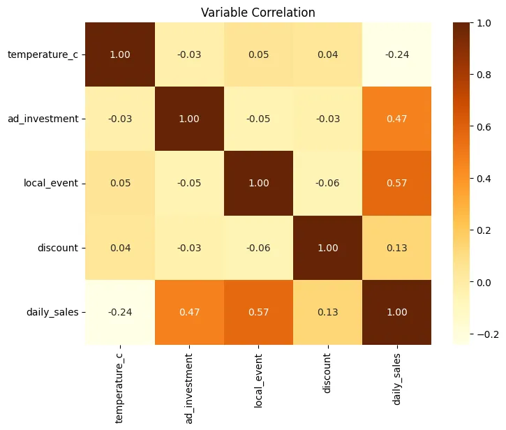 Correlation Heatmap
Let's break down the correlation matrix, interpreting each value, but first, let's remember what each number means:
- 1.00: perfect positive correlation
- 0.00: no linear relationship
- -1.00: perfect negative correlation
The matrix is symmetric, that is:
Corr(A, B) = Corr(B, A)
That's why you'll see the same values reflected above and below the diagonal.
The main diagonal is always 1.00, because each variable is perfectly correlated with itself.
The variables included are:
temperature_cad_investmentlocal_eventdiscountdaily_sales
temperature_c: Temperature in degrees Celsius.
- temperature_c - temperature_c = 1.00 Perfect correlation with itself.
- temperature_c - ad_investment = -0.03 Practically no relationship. Temperature does not influence how much is invested in advertising.
- temperature_c - local_event = 0.05 Very weak positive correlation. Local events do not really depend on the weather in this dataset.
- temperature_c - discount = 0.04 No relevant relationship. Discounts do not appear to be affected by temperature.
- temperature_c - daily_sales = -0.24
Weak to moderate negative correlation.
When the temperature rises, sales tend to decrease slightly.
This may indicate:- The business sells products that are consumed more in cooler weather.
- There is less foot traffic on very hot days.
It is not a strong relationship, but it is consistent.
ad_investment: Investment in advertising.
- ad_investment - ad_investment = 1.00
- ad_investment - local_event = -0.05 Practically independent. Advertising investment does not depend directly on whether there is an event.
- ad_investment - discount = -0.03 No relationship. Investment and discounts appear to be separate decisions.
- ad_investment - daily_sales = 0.47
Moderate positive correlation.
This means:- Higher investment leads to higher sales.
- The relationship is significant, but not perfect.
- Other factors are also influencing it.
Statistically, it is an important predictor.
local_event: Local event.
- local_event - local_event = 1.00
- local_event - discount = -0.06 Almost no correlation. It doesn't seem that events necessarily imply discounts.
- local_event - daily_sales = 0.57
This is the highest correlation with sales.
Interpretation:- When there is a local event, sales increase significantly.
- It is the most influential factor in the dataset.
- It represents a key variable for the model.
In practical terms: Events generate additional traffic or demand.
discount: Discount.
- discount - discount = 1.00
- discount - daily_sales = 0.13
Weak positive correlation.
This means:- Discounts have a small impact.
- They don't appear to be the main driver of sales.
Possible explanations:- Low discounts
- Poor strategy
- Or an effect conditioned by other variables
daily_sales: Daily sales.
We have already interpreted all their correlations with the other variables:
| Variable | Correlation |
|---|---|
| temperature_c | -0.24 |
| ad_investment | 0.47 |
| local_event | 0.57 |
| discount | 0.13 |
Ordered by linear impact:
- local_event (0.57)
- ad_investment (0.47)
- temperature_c (-0.24)
- discount (0.13)
What does this tell us in terms of modeling?
First, the most predictive variables for estimating sales are:
- local_event
- ad_investment
Both should be included in the model.
Then we have multicollinearity.
We observe that:
- No independent variable has a high correlation with another.
- All values between predictors are close to 0.
This is excellent because it means there is no strong redundancy and that each variable provides distinct information.
If we had values close to 1 or -1 between predictors (for example, ad_investment and local_event), we would have to consider removing or combining variables to avoid multicollinearity problems.
So, with all this, we can conclude:
- Local events are the main sales driver.
- Advertising investment has a clear and consistent impact.
- Temperature has a slightly negative effect.
- Discounts have a low impact.
- There is no problematic multicollinearity.
- The dataset is suitable for a multiple regression model.
With this information, a coffee shop manager could make strategic decisions such as:
- Prioritize campaigns during local events.
- Maintain consistent advertising investment.
- Re-evaluate discount strategy.
- Consider specific strategies for hot days.
Step 4: From Data to Prediction (Modeling)
With the completed EDA, we transform the weather data into a binary format and feed it into a Simple Linear Regression model.
from sklearn.model_selection import train_test_split
from sklearn.linear_model import LinearRegression
from sklearn.metrics import mean_absolute_error, mean_squared_error, r2_score

# One-Hot Encoding: Converts "Sunny" or "Rainy" into columns of 0s and 1s
df_encoded = pd.get_dummies(df, columns=["weather"])
X = df_encoded.drop("daily_sales", axis=1)
y = df_encoded["daily_sales"]

# Train-test split: 80% for training, 20% for testing
X_train, X_test, y_train, y_test = train_test_split(X, y, test_size=0.2, random_state=42)

coffee_shop_model = LinearRegression()
coffee_shop_model.fit(X_train, y_train)

# Make predictions on the test set
predictions = coffee_shop_model.predict(X_test)
Step 5: Evaluating the Model
Now let's assess how "accurate" our algorithm is by comparing sales against its predictions.
mae = mean_absolute_error(y_test, predictions)
rmse = np.sqrt(mean_squared_error(y_test, predictions))
r2 = r2_score(y_test, predictions)

print(f"MAE: ${mae:.2f}")
print(f"RMSE: ${rmse:.2f}")
print(f"R^2: {r2:.2f}")
Resulting in:
MAE: $55.39
RMSE: $74.51
: 0.88
What do these numbers mean?
- MAE (Mean Absolute Error): On average, our predictions deviate from actual sales by approximately
$55.39. This gives us an idea of the magnitude of the error in monetary terms. - RMSE (Mean Squared Error): By penalizing larger errors more, the RMSE of
$74.51indicates that, although most predictions are close, there are some cases where the model is significantly off. - R² (Determination Score): An R² of 0.88 means that the model explains 88% of the variability in daily sales. This is a pretty good result, indicating that the model captures most of the patterns present in the data.
Predictions vs. Actual Chart
plt.figure(figsize=(8,5))
sns.scatterplot(x=y_test, y=predictions)
plt.plot([y.min(), y.max()], [y.min(), y.max()], 'r--')  # Perfect reference line
plt.title("Predictions vs Actual Sales")
plt.xlabel("Actual Sales ($)")
plt.ylabel("Model Predictions ($)")
plt.show()
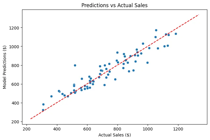 Predictions vs. Actual Sales
As we can see, we have a reference line (in red) that represents perfection: if all predictions were exactly on that line, the model would be perfect, but reality will never be that ideal. However, most points are grouped around that line, indicating that the model has a good overall performance. Some points are further away, reflecting cases where the model does not predict as well, possibly due to factors not captured in the dataset or inherent variability in daily sales.
We can also obtain the coefficients of the model to understand the importance of each variable:
coefficients = pd.DataFrame({
    'Feature': X.columns,
    'Coefficient': coffee_shop_model.coef_
})
display(coefficients.sort_values(by='Coefficient', ascending=False))
This gives us the following result:
| Feature | Coefficient |
|---|---|
| local_event | 261.839739 |
| weather_Rainy | 124.573377 |
| discount | 4.837618 |
| ad_investment | 2.482678 |
| temperature_c | -8.578684 |
| weather_Cloudy | -28.151991 |
| weather_Sunny | -96.421386 |
This tells us the impact of each variable on daily sales, holding the others constant. For example:
- A local event (local_event) increases sales by approximately
$261.84. - A rainy day (weather_Rainy) increases sales by approximately
$124.57. - A discount (discount) increases sales by approximately
$4.84for each percentage point of discount. - Each additional dollar invested in advertising (ad_investment) increases sales by approximately
$2.48. - Each additional degree Celsius (temperature_c) decreases sales by approximately
$8.58. - A cloudy day (weather_Cloudy) decreases sales by approximately
$28.15. - A sunny day (weather_Sunny) decreases sales by approximately
$96.42.
What improvements can we make to the model?
- Feature Engineering: Explore the creation of new features from existing ones. For example, interaction terms between
ad_investmentanddiscount, ortemperature_candweather, could capture more complex relationships. - Non-linear Relationships: The current model is linear. If scatter plots suggest non-linear relationships (e.g., sales reaching a maximum at a certain temperature and then decreasing), polynomial features or other non-linear models (such as Random Forest or Gradient Boosting) could capture them better.
- Temporal Aspects: Since the data is daily sales, there might be temporal patterns (e.g., weekday effects, seasonality not fully captured by
weather). Incorporating features like the day of the week, month, or using specific time series models could be beneficial. - Outlier Detection: Investigate any potential outliers in the data that might be disproportionately influencing the model's coefficients and predictions.
- More Data: While not always feasible, having a more diverse dataset (e.g., from different coffee shops, over a longer period, and with more varied conditions) could help the model generalize better.