
Experimenting with the Titanic Survival Dataset
Let's explore the Titanic survival dataset using exploratory data analysis (EDA) techniques to discover patterns and relationships between passenger characteristics and their survival.
This time we will experiment with EDA (Exploratory Data Analysis) using the Titanic survival dataset.
In the previous article in this machine learning series, we conducted a similar exercise for a coffee shop: Experimenting with Exploratory Data Analysis
A Practical Exercise: The Titanic Dataset
The Titanic dataset is a classic in machine learning. It includes information about passengers (age, gender, class, fare, embarkation port, etc.) and the target variable survived, which indicates whether the person survived (1) or not (0).
We will use it to practice a complete workflow, but this time with a focus on cleaning and evaluation techniques:
- Data loading and initial review.
- Data cleaning and variable transformation.
- EDA with visualizations.
- Preparation for modeling.
- Training and evaluation with multiple metrics.
You can view the complete notebook with the code and visualizations here: EDA with the Titanic dataset
1. Data Loading and Initial Review
We start by importing libraries, loading the dataset, and reviewing its structure/types to understand what we are working with.
import pandas as pd
import numpy as np
import matplotlib.pyplot as plt
import seaborn as sns

# Plot style configuration
sns.set_style('whitegrid')
plt.rcParams['figure.figsize'] = (12, 8)

# Load the Titanic dataset from seaborn
df_raw = sns.load_dataset('titanic')
df = df_raw.copy()

print('First 5 rows of the raw dataset:')
display(df.head())

print(f"\nDataset shape: {df.shape[0]} rows x {df.shape[1]} columns")
print('\nData types:')
display(df.dtypes.to_frame(name='dtype'))
Here we observe a mix of numeric and categorical variables, along with columns containing null values (e.g., deck) and some redundant variables (alive vs survived, class vs pclass).
| survived | pclass | sex | age | sibsp | parch | fare | embarked | class | who | adult_male | deck | embark_town | alive | alone |
|---|---|---|---|---|---|---|---|---|---|---|---|---|---|---|
| 0 | 3 | male | 22 | 1 | 0 | 7.25 | S | Third | man | True | NaN | Southampton | no | False |
| 1 | 1 | female | 38 | 1 | 0 | 71.2833 | C | First | woman | False | C | Cherbourg | yes | False |
| 1 | 3 | female | 26 | 0 | 0 | 7.925 | S | Third | woman | False | NaN | Southampton | yes | True |
| 1 | 1 | female | 35 | 1 | 0 | 53.1 | S | First | woman | False | C | Southampton | yes | False |
| 0 | 3 | male | 35 | 0 | 0 | 8.05 | S | Third | man | True | NaN | Southampton | no | True |
2. Null Values and Data Cleaning
Now we apply a basic cleaning, focused on:
- Removing very incomplete or redundant columns.
- Imputing null values strategically.
- Encoding categorical variables.
By imputing, we refer to filling missing values with some strategy (median, mode, etc.) to avoid losing complete rows, so we can continue using that information without introducing biases or unnecessary noise.
# 1) Missing values overview
print('Missing values per column (raw):')
print(df.isnull().sum().sort_values(ascending=False))

# 2) Basic cleaning
cols_to_drop = ['deck', 'embark_town', 'alive', 'class', 'who', 'adult_male']
df = df.drop(columns=cols_to_drop)

# 3) Impute missing values
df['age'] = df['age'].fillna(df['age'].median())
df['embarked'] = df['embarked'].fillna(df['embarked'].mode()[0])

# 4) Encode categorical variables
df['sex'] = df['sex'].map({'male': 0, 'female': 1})
df = pd.get_dummies(df, columns=['embarked'], drop_first=True, dtype=int)

print('\nMissing values after cleaning:')
print(df.isnull().sum().sum())
We use the median for age because it is robust against outliers, and the mode for embarked because it is categorical.
The median is the value that lies in the middle of an ordered dataset, making it less sensitive to extreme values (outliers) that could distort the mean. This is why it's common to use it for imputing ages, where there might be very young or very elderly passengers.
The mode is the most frequent value in a column, making it suitable for categorical variables like
embarked, where we want to fill nulls with the most common category without introducing new categories or biases.
Also, we apply One-Hot Encoding to embarked with drop_first=True to avoid multicollinearity.
Let's pause here for a moment: when applying One-Hot Encoding to a variable with n categories, n binary columns are created (one for each category).
It goes from being a single column like:
| embarked |
|---|
| S |
| C |
| Q |
Three binary columns:
| embarked_C | embarked_Q | embarked_S |
|---|---|---|
| 0 | 0 | 1 |
| 1 | 0 | 0 |
| 0 | 0 | 1 |
The problem is that if all categories are included, one can always be deduced from the others (because if it's not C nor Q, then it must be S), which generates multicollinearity, i.e., repeated information that can confuse models like linear or logistic regression and make their results unstable. Therefore, when using drop_first=True, one of the categories is removed and becomes the implicit reference, avoiding that redundancy and making the model work more stably and clearly.
With the implicit reference, we refer to the fact that if embarked_S is 0 and embarked_Q is 0, then by default we know the passenger embarked at C, without needing an explicit column for that.
Let's review how the dataset looks now:
print('First 5 rows after preprocessing:')
display(df.head())

print('\nSummary statistics (numeric features):')
display(df.describe().T)
| survived | pclass | sex | age | sibsp | parch | fare | alone | embarked_Q | embarked_S |
|---|---|---|---|---|---|---|---|---|---|
| 0 | 3 | 0 | 22 | 1 | 0 | 7.25 | False | 0 | 1 |
| 1 | 1 | 1 | 38 | 1 | 0 | 71.2833 | False | 0 | 0 |
| 1 | 3 | 1 | 26 | 0 | 0 | 7.925 | True | 0 | 1 |
| 1 | 1 | 1 | 35 | 1 | 0 | 53.1 | False | 0 | 1 |
| 0 | 3 | 0 | 35 | 0 | 0 | 8.05 | True | 0 | 1 |
| count | mean | std | min | 25% | 50% | 75% | max | |
|---|---|---|---|---|---|---|---|---|
| survived | 891 | 0.383838 | 0.486592 | 0 | 0 | 0 | 1 | 1 |
| pclass | 891 | 2.308642 | 0.836071 | 1 | 2 | 3 | 3 | 3 |
| sex | 891 | 0.352413 | 0.47799 | 0 | 0 | 0 | 1 | 1 |
| age | 891 | 29.361582 | 13.019697 | 0.42 | 22 | 28 | 35 | 80 |
| sibsp | 891 | 0.523008 | 1.102743 | 0 | 0 | 0 | 1 | 8 |
| parch | 891 | 0.381594 | 0.806057 | 0 | 0 | 0 | 0 | 6 |
| fare | 891 | 32.204208 | 49.693429 | 0 | 7.9104 | 14.4542 | 31 | 512.3292 |
| embarked_Q | 891 | 0.08642 | 0.281141 | 0 | 0 | 0 | 0 | 1 |
| embarked_S | 891 | 0.725028 | 0.446751 | 0 | 0 | 1 | 1 | 1 |
From this descriptive statistics, we see that age has a wide range (from babies to elderly), and fare (fare) also varies significantly, with some passengers paying very high fares (likely from first class).
3. EDA: Distributions and Relationships
With the cleaned data, let's start exploring visually:
Distribution of the target variable
plt.figure(figsize=(7, 5))
ax = sns.countplot(data=df, x='survived', palette='viridis', hue='survived', legend=False)
plt.title('Survival Distribution (0 = No, 1 = Yes)')
plt.xlabel('Survived')
plt.ylabel('Passenger Count')

# Add percentage labels
total = len(df)
for p in ax.patches:
    height = p.get_height()
    ax.annotate(f'{(height/total)*100:.1f}%',
                (p.get_x() + p.get_width() / 2, height),
                ha='center', va='bottom', fontsize=10, xytext=(0, 4),
                textcoords='offset points')

plt.tight_layout()
plt.show()
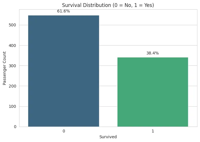 Of the 891 passengers, approximately 38% survived.
We see a more frequent negative outcome (more passengers did NOT survive), so it's worth evaluating something more than accuracy.
Survival by Sex and Class
fig, axes = plt.subplots(1, 2, figsize=(14, 5))

sns.barplot(data=df, x='sex', y='survived', ax=axes[0], palette='Set2', hue='sex', legend=False)
axes[0].set_title('Survival Rate by Sex (0 = Male, 1 = Female)')
axes[0].set_xlabel('Sex')
axes[0].set_ylabel('Mean Survival Rate')

sns.barplot(data=df, x='pclass', y='survived', ax=axes[1], palette='Set2', hue='pclass', legend=False)
axes[1].set_title('Survival Rate by Passenger Class')
axes[1].set_xlabel('Passenger Class')
axes[1].set_ylabel('Mean Survival Rate')

plt.tight_layout()
plt.show()
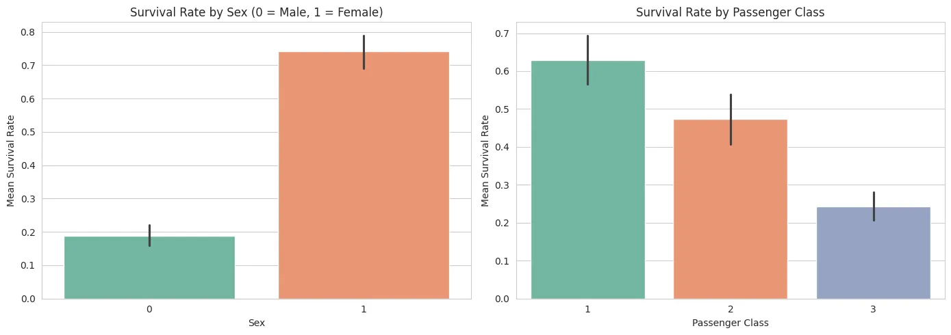 Greater survival in women, plus a positive trend as the passenger class increases.
A expected pattern is maintained: higher survival rates in women and in higher passenger classes.
Correlation Matrix
corr = df.corr(numeric_only=True)
plt.figure(figsize=(10, 8))
sns.heatmap(corr, annot=True, fmt='.2f', cmap='coolwarm', square=True, linewidths=0.4)
plt.title('Feature Correlation Matrix')
plt.tight_layout()
plt.show()
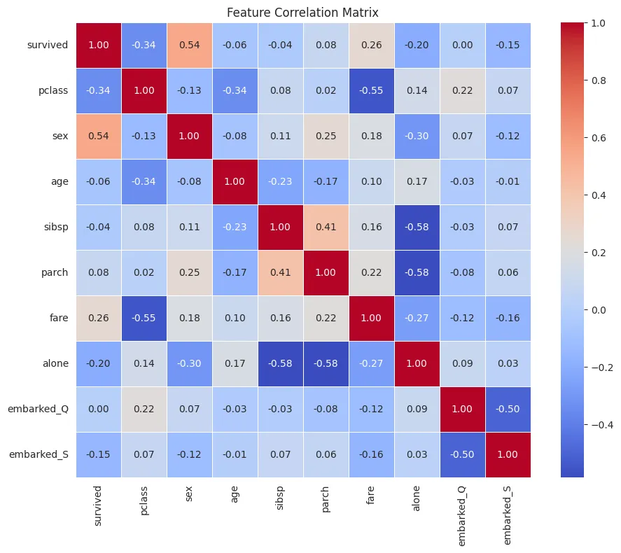 Feature Correlation Matrix
survived is our target variable, so we're interested in seeing which variables have the greatest influence:
sex(0.54) - moderate-to-high positive correlation.
Sex has a significant influence on survival.
pclass(-0.34) - moderate negative correlation.
Lower class (3rd class = higher number) means a lower probability of survival.
fare(0.26) - low-to-moderate positive correlation.
Higher fare paid means a higher probability of survival (related to class).
alone(-0.20) - slight negative correlation.
Traveling alone slightly decreases the probability of survival.
age(-0.06) - almost no linear relationship; that is, age does not clearly influence survival in this case.
Let's look for other strong correlations between independent variables:
sibspandparch(0.41) Moderate relationship. Both measure family members on board.sibspandalone(-0.58) Strong negative relationship. Although, well, it's to be expected that if you have siblings/spouses on board, you don't travel alone (?).parchandalone(-0.58) Same logic: if you have parents/children on board, you don't travel alone.pclassandfare(-0.55) Strong negative correlation. Better class -> higher price.
With the above, we have detected that some variables contain similar information.
embarked_Qandembarked_S(-0.50) This makes sense because if one is 1, the other is likely 0.
This is typical when creating dummy variables, which is why drop_first=True is usually used to avoid perfect redundancy.
Let's now look at the relationship between age and fare with survived using boxplots:
fig, axes = plt.subplots(1, 2, figsize=(14, 5))

sns.boxplot(data=df, x='survived', y='age', ax=axes[0])
axes[0].set_title('Distribution of Age by Survival')
axes[0].set_xlabel('Survival')
axes[0].set_ylabel('Age')

sns.boxplot(data=df, x='survived', y='fare', ax=axes[1])
axes[1].set_title('Distribution of Fare by Survival')
axes[1].set_xlabel('Survival')
axes[1].set_ylabel('Fare')

plt.tight_layout()
plt.show()
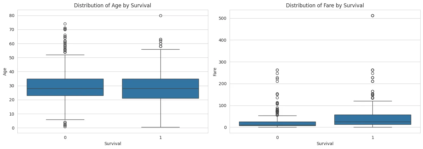 Age and Survival Fee Boxplots
The boxplots show how age and fare are distributed according to whether the person survived or not. In the case of age, the boxes and center lines (medians) are very similar between both groups, indicating that age, in general, does not make a clear difference in survival. However, some extreme values are observed, such as very young children and elderly people, suggesting that differences might exist when analyzed by age groups. In contrast, the fare graph shows a clearer difference: those who survived paid, on average, higher fares.
This indicates that the ticket price (related to social class) had a greater influence on the probability of survival than age.
Variable Engineering and Analysis by Survival Rate
To delve deeper into EDA, we will now create new variables and analyze combinations of categorical and numerical variables using survival rates (the mean of survived) instead of just counts.
1) Create family_size
This gives us an idea of the size of the family group on board, which could influence survival (for example, large families might have more difficulty evacuating).
# Work on a copy so downstream modeling cells remain unchanged
df_eda = df.copy()
# family_size = passenger + close family members on board
df_eda['family_size'] = df_eda['sibsp'] + df_eda['parch'] + 1
print('family_size summary:')
display(df_eda['family_size'].describe())

plt.figure(figsize=(8, 5))
sns.countplot(data=df_eda, x='family_size', palette='crest', hue='family_size', legend=False)
plt.title('Family Size Distribution')
plt.xlabel('Family Size')
plt.ylabel('Passenger Count')
plt.tight_layout()
plt.show()
2) Grouping Ages into Bins (age_group)
Here we can create age groups to see if there are clearer differences in survival rates between children, young people, adults, and the elderly.
age_bins = [0, 12, 18, 35, 60, np.inf]
age_labels = ['child', 'teen', 'young_adult', 'adult', 'senior']
df_eda['age_group'] = pd.cut(df_eda['age'], bins=age_bins, labels=age_labels, right=False)

print('Age-group distribution:')
display(df_eda['age_group'].value_counts(dropna=False).sort_index())
3) Apply logarithmic transformation to fare
By applying a logarithm, we reduce the impact of extreme values and can better visualize the fare distribution.
# log1p maneja correctamente tarifas en 0
df_eda['fare_log'] = np.log1p(df_eda['fare'])

fig, axes = plt.subplots(1, 2, figsize=(14, 5))
sns.histplot(df_eda['fare'], kde=True, ax=axes[0], color='#2a9d8f')
axes[0].set_title('Original Fare Distribution')
axes[0].set_xlabel('Fare')

sns.histplot(df_eda['fare_log'], kde=True, ax=axes[1], color='#e76f51')
axes[1].set_title('Transformed Fare: log(1 + fare)')
axes[1].set_xlabel('Fare (log1p)')
plt.tight_layout()
plt.show()
4) Crosstabs
We graph combinations of categorical variables to see how passengers are distributed according to sex, class, age groups, and bundled fares.
# Additional fare bins for crosstab/grouped survival analysis
df_eda['fare_group'] = pd.qcut(df_eda['fare'], q=4, labels=['Q1', 'Q2', 'Q3', 'Q4'])

# Crosstabs
ct_sex_pclass = pd.crosstab(df_eda['sex'], df_eda['pclass'], margins=True)
print('Crosstab: sex + pclass')
display(ct_sex_pclass)

ct_pclass_fare = pd.crosstab(df_eda['pclass'], df_eda['fare_group'], margins=True)
print('Crosstab: pclass + fare_group')
display(ct_pclass_fare)

ct_age_survived = pd.crosstab(df_eda['age_group'], df_eda['survived'], margins=True)
print('Crosstab: age_group + survived')
display(ct_age_survived)
5) Visualize survival rate instead of just distributions
Now we will plot the survival rate (mean of survived) for key combinations, giving us a clearer view of how the probabilities of survival change based on different characteristics.
fig, axes = plt.subplots(1, 3, figsize=(18, 5))

survival_sex_pclass = (
    df_eda.groupby(['sex', 'pclass'])['survived']
    .mean()
    .reset_index()
 )
sns.barplot(
    data=survival_sex_pclass,
    x='pclass',
    y='survived',
    hue='sex',
    palette='Set2',
    ax=axes[0]
 )
axes[0].set_title('Survival Rate by Sex and Class')
axes[0].set_xlabel('Passenger Class')
axes[0].set_ylabel('Survival Rate')
axes[0].set_ylim(0, 1)
axes[0].legend(title='Sex (0=male, 1=female)')

survival_pclass_fare = (
    df_eda.groupby(['pclass', 'fare_group'], observed=False)['survived']
    .mean()
    .reset_index()
 )
sns.barplot(
    data=survival_pclass_fare,
    x='pclass',
    y='survived',
    hue='fare_group',
    palette='viridis',
    ax=axes[1]
 )
axes[1].set_title('Survival Rate by Class and Fare Quartile')
axes[1].set_xlabel('Passenger Class')
axes[1].set_ylabel('Survival Rate')
axes[1].set_ylim(0, 1)
axes[1].legend(title='Fare Group')

survival_age = df_eda.groupby('age_group', observed=False)['survived'].mean().reset_index()
sns.barplot(data=survival_age, x='age_group', y='survived', palette='mako', hue='age_group', legend=False, ax=axes[2])
axes[2].set_title('Survival Rate by Age Group')
axes[2].set_xlabel('Age Group')
axes[2].set_ylabel('Survival Rate')
axes[2].set_ylim(0, 1)

plt.tight_layout()
plt.show()
Here, much clearer and more structural patterns emerge in the data.
First, family size shows that the majority of passengers traveled alone (family size = 1) and that large groups were uncommon. This suggests that family-related variables are highly concentrated at low values and that traveling alone is the dominant case, which may influence the model.
In the fare, the original distribution is strongly skewed to the right: most paid little, and a few paid very high amounts. Applying the logarithmic transformation (log(1 + fare)) makes the distribution much more balanced and manageable for statistical models, reducing the impact of extreme values.
In survival by sex and class, the pattern is striking: women survive much more than men in all classes, and first class has the highest survival rates. This reaffirms that sex and social class were determining factors in survival.
When analyzing class along with fare quartiles, it is confirmed that paying more within each class generally increases the probability of survival, especially in first and second class. This reinforces the importance of socioeconomic status.
Finally, survival by age group indicates that children have the highest survival rate, while older adults have the lowest. This demonstrates that age does influence survival, but in a segmented (non-linear) way, something that simple correlation failed to show.
Taken together, these graphs reveal that survival did not depend on a single isolated factor, but rather on the combination of sex, social class, fare paid, and age group.
4. Preparation for Modeling
Before training, we separated features/targets, performed stratified splitting, and scaled continuous variables (age, fare).
from sklearn.model_selection import train_test_split, StratifiedKFold, cross_val_score
from sklearn.preprocessing import StandardScaler

# Define features and target
X = df.drop(columns=['survived'])
y = df['survived']

# Train/test split with stratification
X_train, X_test, y_train, y_test = train_test_split(
    X, y, test_size=0.2, random_state=42, stratify=y
)

print('Target distribution (train):')
print(y_train.value_counts(normalize=True).rename('proportion').round(3))

# Scale continuous features only
scaler = StandardScaler()
cols_to_scale = ['age', 'fare']

X_train_scaled = X_train.copy()
X_test_scaled = X_test.copy()

X_train_scaled[cols_to_scale] = scaler.fit_transform(X_train[cols_to_scale])
X_test_scaled[cols_to_scale] = scaler.transform(X_test[cols_to_scale])

print('\nPrepared train shape:', X_train_scaled.shape)
print('Prepared test shape:', X_test_scaled.shape)
5. Baseline with Logistic Regression
We trained a logistic regression with class_weight='balanced' to better handle the relative class imbalance.
from sklearn.linear_model import LogisticRegression

# Train logistic regression baseline
model = LogisticRegression(random_state=42, max_iter=1000, class_weight='balanced')
model.fit(X_train_scaled, y_train)

# Predictions
y_pred = model.predict(X_test_scaled)
y_pred_proba = model.predict_proba(X_test_scaled)[:, 1]

# 5-fold CV score on training split (AUC)
cv = StratifiedKFold(n_splits=5, shuffle=True, random_state=42)
cv_auc = cross_val_score(model, X_train_scaled, y_train, cv=cv, scoring='roc_auc')

print(f'Cross-validated ROC-AUC (train, mean +/- std): {cv_auc.mean():.3f} +/- {cv_auc.std():.3f}')
Resulting in:
Cross-validated ROC-AUC (train, mean +/- std): 0.856 +/- 0.021
In simple terms: If you randomly select one person who survived and one who didn't, the model has approximately an 85.6% probability of assigning a higher probability to the one who actually survived. Perhaps this isn't very clear, so let's look at it another way:
- You take a passenger who survived.
- You take another passenger who didn't survive.
- You ask the model, "What probability do you give each of them of having survived?"
- The model assigns a probability of survival to each, for example, 0.8 for the survivor and 0.3 for the non-survivor.
If the passenger who actually survived has a higher assigned probability than the one who didn't survive, then the model was correct in that comparison. The ROC-AUC measures the proportion of times this occurs across all possible combinations of surviving and non-surviving passengers.
ROC-AUC (Receiver Operating Characteristic - Area Under the Curve) is a metric that evaluates a model's ability to distinguish between classes. In this case, it measures how well the model can differentiate between passengers who survived and those who did not.
It ranges from 0.5 (total randomness) to 1.0 (perfect classification).
0.856 indicates that the model has very good discrimination capabilities.
6. Complete Model Evaluation
In addition to the classification_report, we added global metrics and complementary curves to provide a more realistic view of performance.
from sklearn.metrics import (
    classification_report,
    confusion_matrix,
    roc_auc_score,
    roc_curve,
    precision_recall_curve,
    average_precision_score,
    accuracy_score,
    f1_score,
    precision_score,
    recall_score,
    ConfusionMatrixDisplay
)

# Core metrics
acc = accuracy_score(y_test, y_pred)
prec = precision_score(y_test, y_pred)
rec = recall_score(y_test, y_pred)
f1 = f1_score(y_test, y_pred)
roc_auc = roc_auc_score(y_test, y_pred_proba)
ap = average_precision_score(y_test, y_pred_proba)

print('Test set metrics:')
print(f'Accuracy:  {acc:.3f}')
print(f'Precision: {prec:.3f}')
print(f'Recall:    {rec:.3f}')
print(f'F1-score:  {f1:.3f}')
print(f'ROC-AUC:   {roc_auc:.3f}')
print(f'PR-AUC:    {ap:.3f}\n')

print('Classification report:')
print(classification_report(y_test, y_pred, target_names=['Did Not Survive', 'Survived']))

# Confusion matrix
cm = confusion_matrix(y_test, y_pred)
fig, ax = plt.subplots(figsize=(6, 5))
disp = ConfusionMatrixDisplay(confusion_matrix=cm, display_labels=['Did Not Survive', 'Survived'])
disp.plot(ax=ax, cmap='Blues', colorbar=False)
ax.set_title('Confusion Matrix - Logistic Regression (Titanic)')
plt.tight_layout()
plt.show()

# ROC curve
fpr, tpr, _ = roc_curve(y_test, y_pred_proba)
plt.figure(figsize=(8, 6))
plt.plot(fpr, tpr, color='darkorange', lw=2, label=f'ROC curve (AUC = {roc_auc:.2f})')
plt.plot([0, 1], [0, 1], color='navy', lw=2, linestyle='--', label='Random baseline')
plt.title('ROC Curve - Logistic Regression (Titanic)')
plt.xlabel('False Positive Rate')
plt.ylabel('True Positive Rate')
plt.legend(loc='lower right')
plt.tight_layout()
plt.show()

# Precision-Recall curve
precision_vals, recall_vals, _ = precision_recall_curve(y_test, y_pred_proba)
plt.figure(figsize=(8, 6))
plt.plot(recall_vals, precision_vals, color='teal', lw=2, label=f'PR curve (AP = {ap:.2f})')
plt.title('Precision-Recall Curve - Logistic Regression (Titanic)')
plt.xlabel('Recall')
plt.ylabel('Precision')
plt.legend(loc='lower left')
plt.tight_layout()
plt.show()
With this pipeline, in testing we obtained approximately:
- Accuracy:
0.793 - Precision:
0.722 - Recall:
0.754 - F1-score:
0.738 - ROC-AUC:
0.851 - PR-AUC:
0.796
These results indicate that your model has a solid and fairly balanced performance on the test set. Let's interpret it step by step.
First, the accuracy (0.793) means that the model correctly classifies approximately 79.3% of the passengers. This is a good value, but on its own it is not sufficient, especially since the dataset is somewhat unbalanced (110 did not survive vs. 69 survived).
In the "Survived" class:
- Precision = 0.722 Of all the people the model predicted as survivors, 72.2% actually survived.
This measures how "reliable" the positive predictions are.
- Recall = 0.754 Of all those who actually survived, the model correctly identified 75.4%.
This measures how many real cases it misses.
- F1-score = 0.738 This is the balance between precision and recall.
It indicates that the model maintains a good balance between detecting survivors and not generating too many false positives.
In the "Did Not Survive" class, the performance is even slightly better (F1 ~ 0.83), which is normal because there are more examples in that class.
Now, the discrimination metrics:
- ROC-AUC = 0.851 The model separates survivors from non-survivors quite well (very good discrimination ability).
- PR-AUC = 0.796 This metric is especially useful when there is an imbalance. A value of 0.796 indicates that the model maintains a good balance between precision and recall when the threshold is varied.
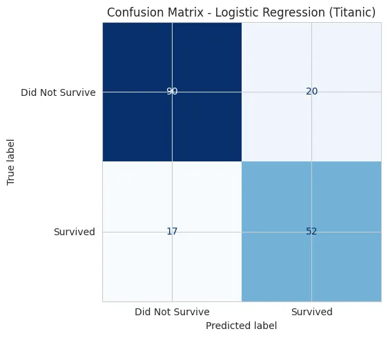 Confusion Matrix
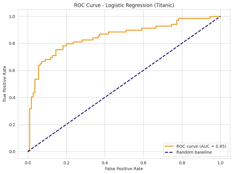 ROC Curve
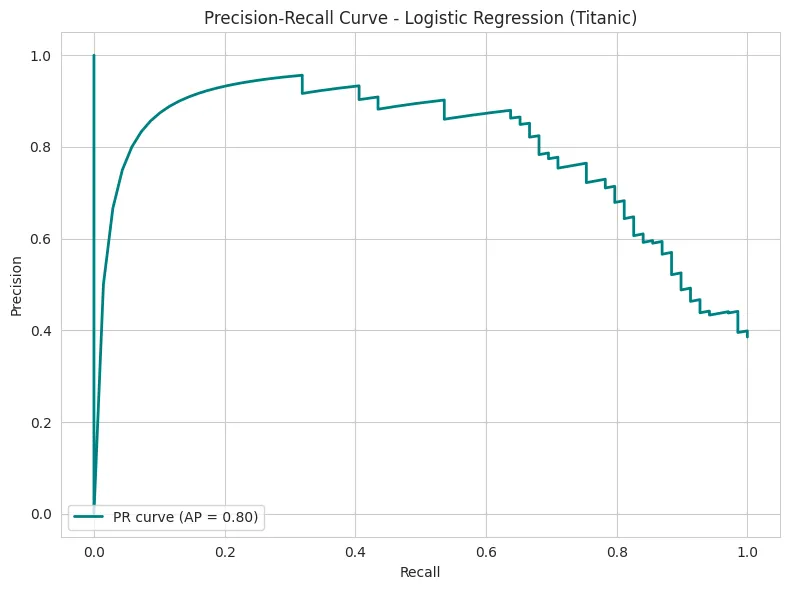 Precision-Recall Curve
Conclusions
Always keep in mind that:
- A good EDA reduces surprises during modeling.
- Proper cleaning and imputation can be as impactful as choosing the model.
- Evaluating with various metrics (not just accuracy) provides a much more realistic picture of the classifier's behavior.
You can find other datasets and experiment on your own, applying this same workflow. It's the best way to learn!
Some interesting dataset sources for practicing EDA and modeling: